
AI Chat Interfaces - "First look" Positioning
ChatGPT, Mistral, Gemini, Claude, Copilot. Are these new-ish technologies landing their message at the get-go?


As an early adopter of AI chat systems, I’m often struck by how much the user experience (UX) assumes about my knowledge of 'how it works.' After thousands of prompts and hours of self-learning, these systems have now become a key part of my search journey. But this makes me wonder, what about those who aren't as invested or interested? How accessible are these technologies to the average person? To explore this, I'll be evaluating how these technologies are marketed today, focusing on two key criteria:
Landing Page - Does the first user touchpoint effectively communicate the chat system's value proposition? Bonus points for differentiation.
First-time User Experience - Can a first-time user easily understand how to use the product and its benefits?
Join me as we delve into these criteria, guided by firsthand experiences.
ChatGPT
Landing Page: 3/10
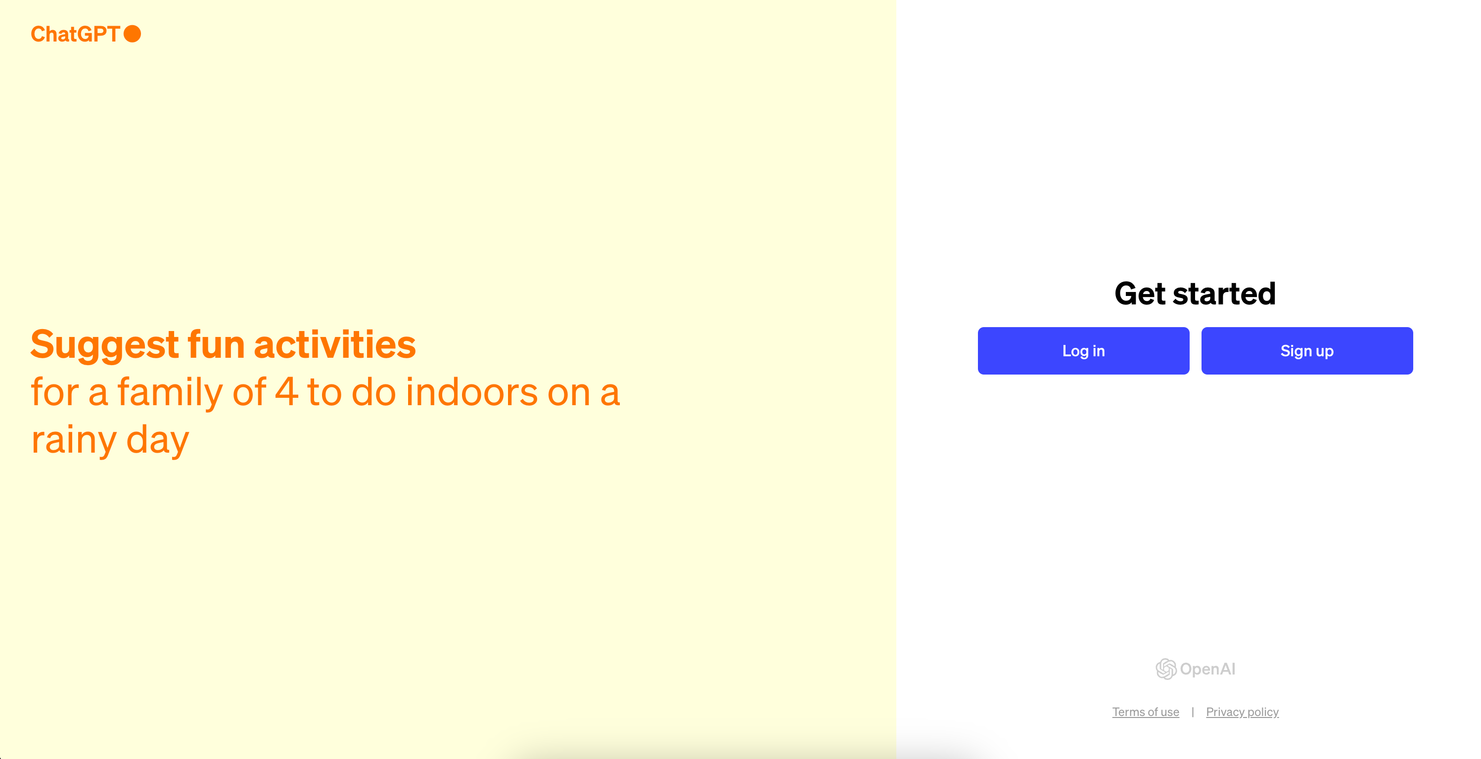
The page is a missed opportunity to land the positioning and get users to try out the product. The prompts are very specific and there is no indication on what the product is and how it benefits you. Understandably, this stems from resting on high awareness levels and the benefits of being an industry leader, so there isn’t pressure to “sell” at the get go. In a landscape brimming with eager competitors, it’ll be just as crucial to find the next as it is to retain the existing 100 million.
First time user experience: 7/10
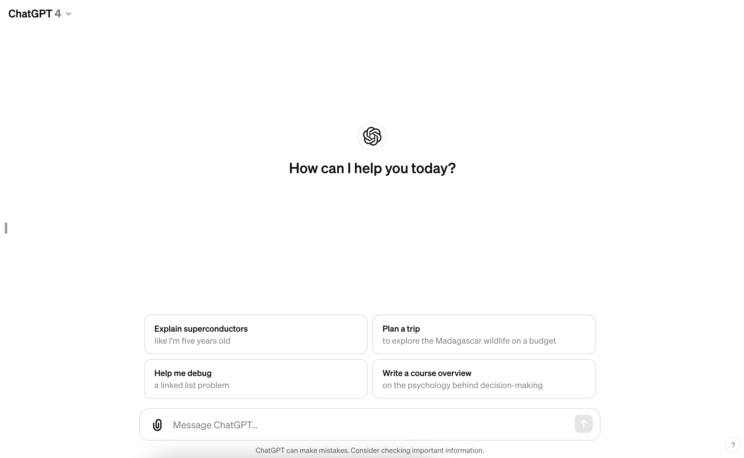
Transitioning into the product, the experience shifts. It’s simple, clean and straightforward. The elegance in its cleanliness is effective. The examples show the diverse range of questions it’s capable of answering. Amidst this clarity, I can’t help but wonder if they have missed an opportunity to introduce the user to the wonderful world of GPTs - there are so many fun ones that might forever be a click away because one is simply unaware. But overall, this interface is a good reminder of their belief: the model is the product.
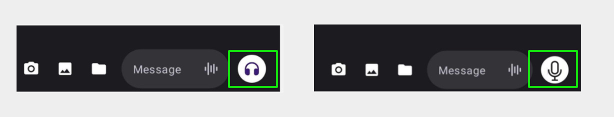
Aside from that, I’d also focus on the voice feature, which is superior to others. Something as simple as replacing the headphone icon with a microphone would accurately represent the functionality.
Mistral
Landing Page: 2/10
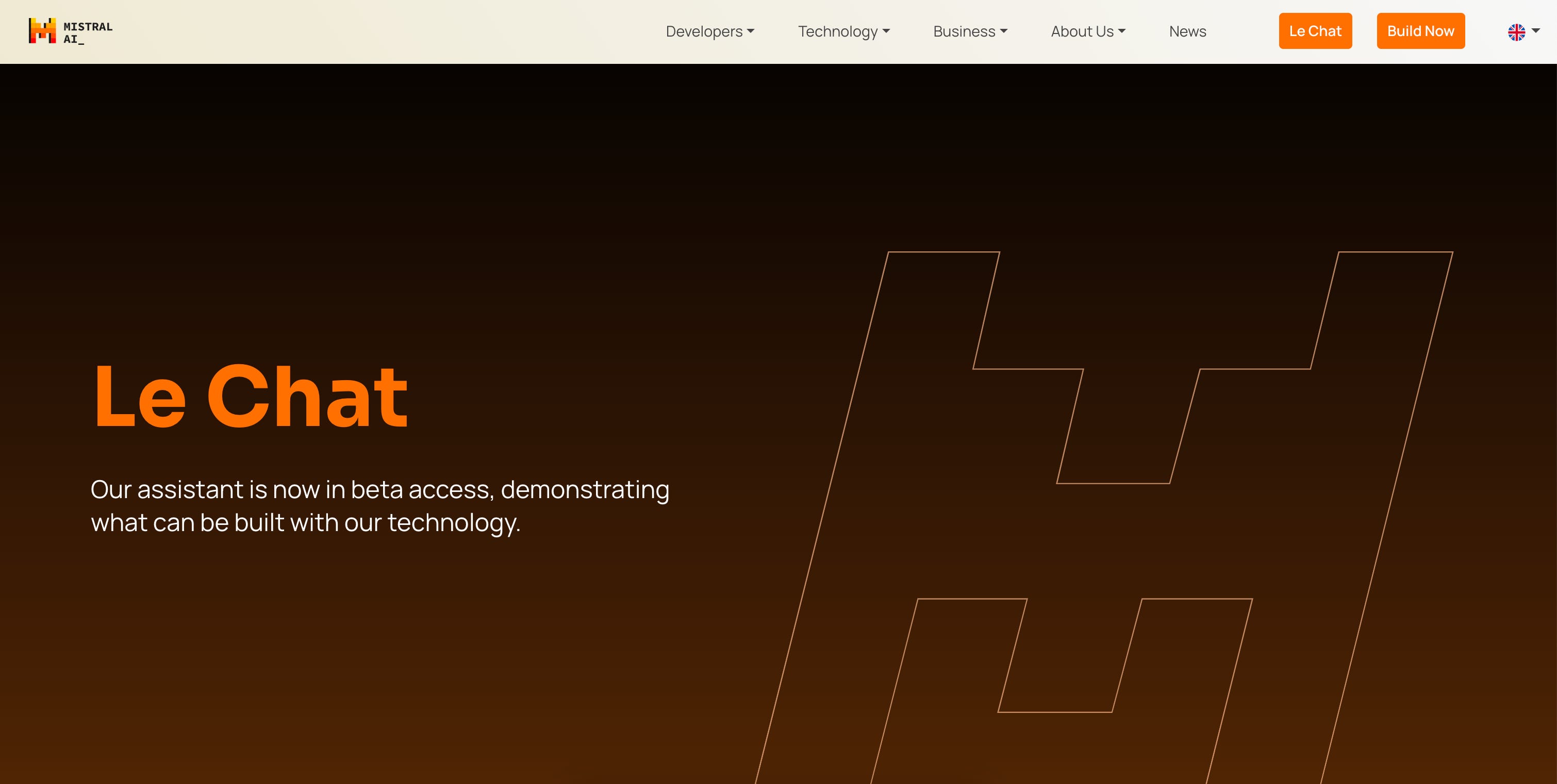
While I understand that Mistral is still in Beta access stage, dedicating ~ 40% of real estate to its logo is a head scratcher. This choice seems excessive, especially when you’d think the focus of beta access is to get users hooked on to the product.
First time user experience: 6/10
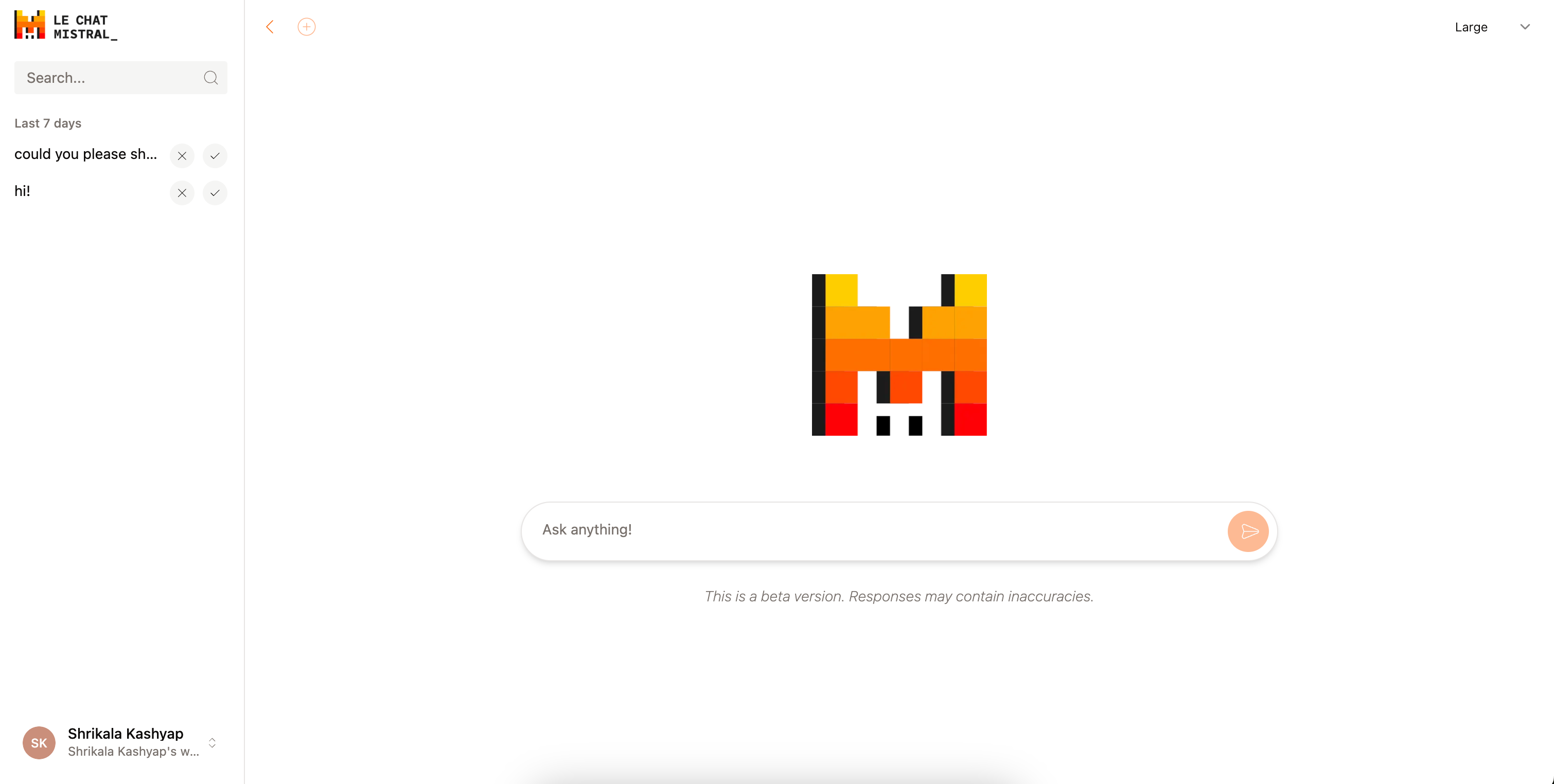
Le Chat presents a clean and simple interface, similar to ChatGPT. It’s easy to navigate and use. There are, however, confusing icons all around that seem to mystify more than clarify. I definitely thought the “large” CTA on the top right was referring to font size. The plus sign on the top left doesn’t result in any action. And again, a good chunk of space goes to the logo, which could instead be used to educate or provide sample prompts.
Microsoft Copilot
Landing Page: 8/10
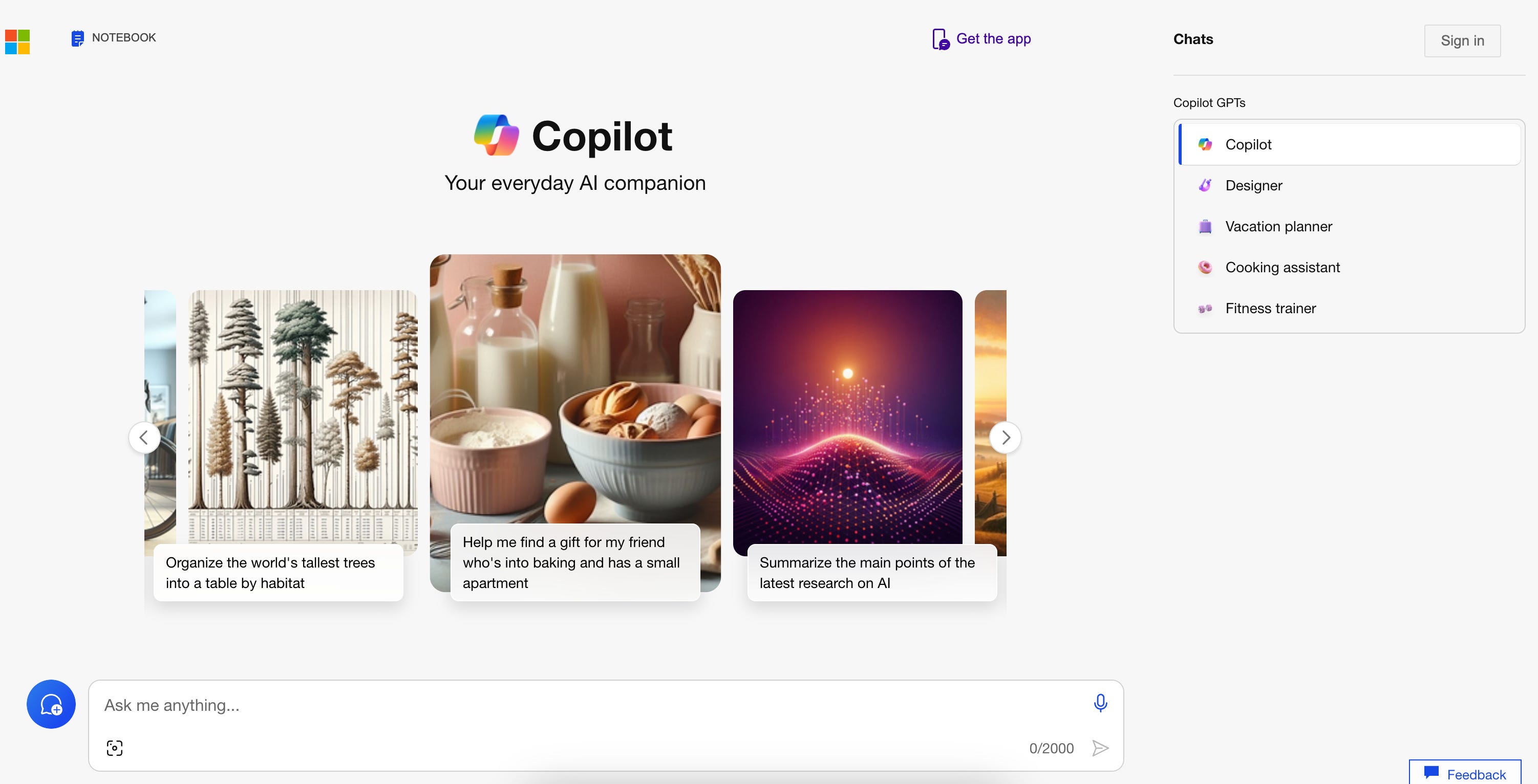
Across all landing pages, Microsoft stands out for me. The value proposition, naming (Copilot) and positioning (Your everyday AI companion) are clear, sticky and differentiated. I say ‘differentiated’ because this is the first company that has positioned AI as a “companion” vs. a utilitarian device (tool, assistant), adding a layer of humanity. To me, the strongest landing pages are the ones where conversion is immediate, and this does just that.
First time user experience: 9/10
Microsoft's significant resources allow for a refined, intuitive user interface. It gets extra points for a page that’s memorable and distinct, setting it apart from a crowded market.
What stood out for me:
Zero friction: The absence of a signup requirement introduces me to the product almost immediately. Positioning it as a “free trial” is enticing if you’re a deal seeker. If not, it comes across as disingenuous.
Visible GPTs: Presenting GPT examples demystifies the technology to new users. You can make a near-accurate guess of what GPTs are capable of, despite the lifestyle choices presented, which may not resonate with everyone's interests or needs.
Use of Visuals: The visuals, while making the screen busier complements its prompts, offering visual cues that cater to different learning styles.
Claude
Landing Page: 8/10
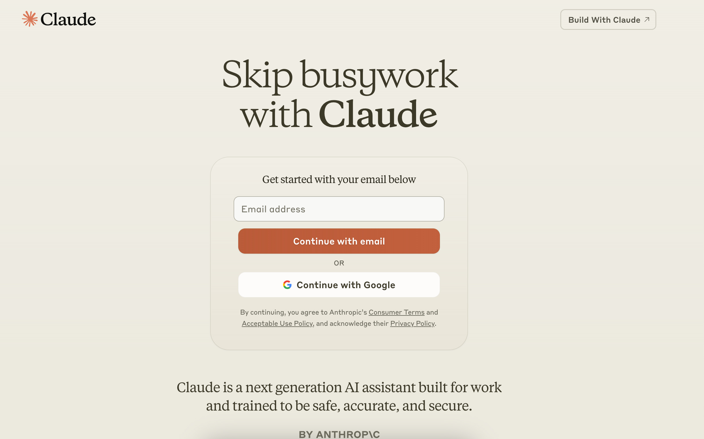
This is a landing page that is a strong competitor to Microsoft’s Copilot. The use of a rolling banner immediately up-levels specific prompts to relatable use-cases. The clear CTA, promptly followed by a succinct value proposition tells you that a product marketer has worked on this. Reading that it’s trained to be safe and secure makes me more confident in adding my email in.
First time user experience: 7/10
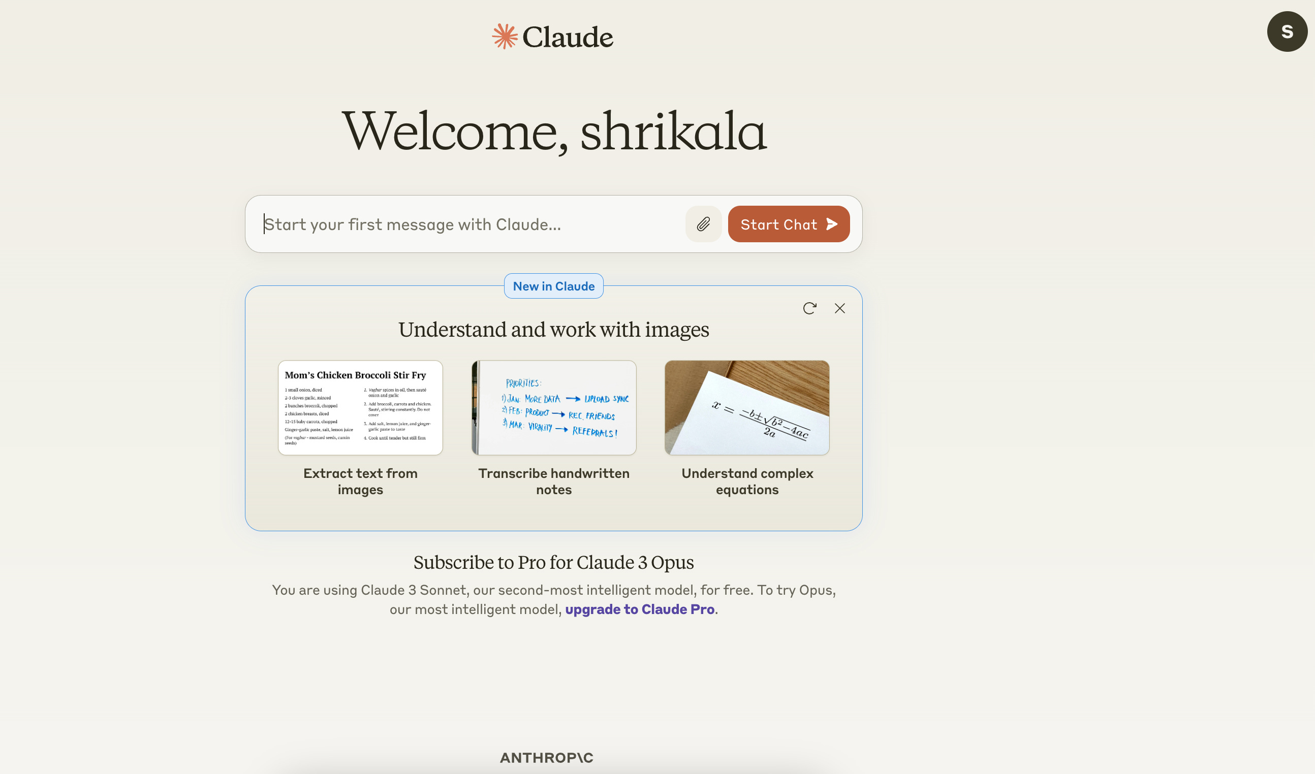
Entering Claude's user interface, I was greeted with a consistent and distinct branding experience. The clean design language starts to get crowded when upselling Pro for Claude 3 Opus — a name that demands a moment to fully grasp. On the other hand, the clarity of icons ensured that, despite any potential busyness caused by upselling efforts, navigation remained intuitive.
Gemini
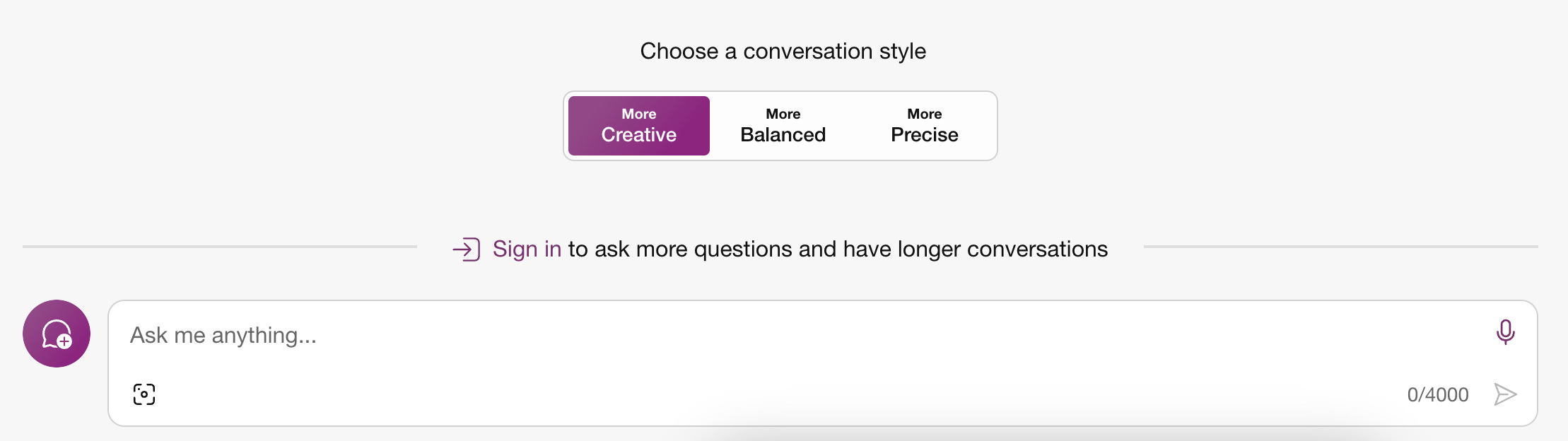
Landing Page - 7/10
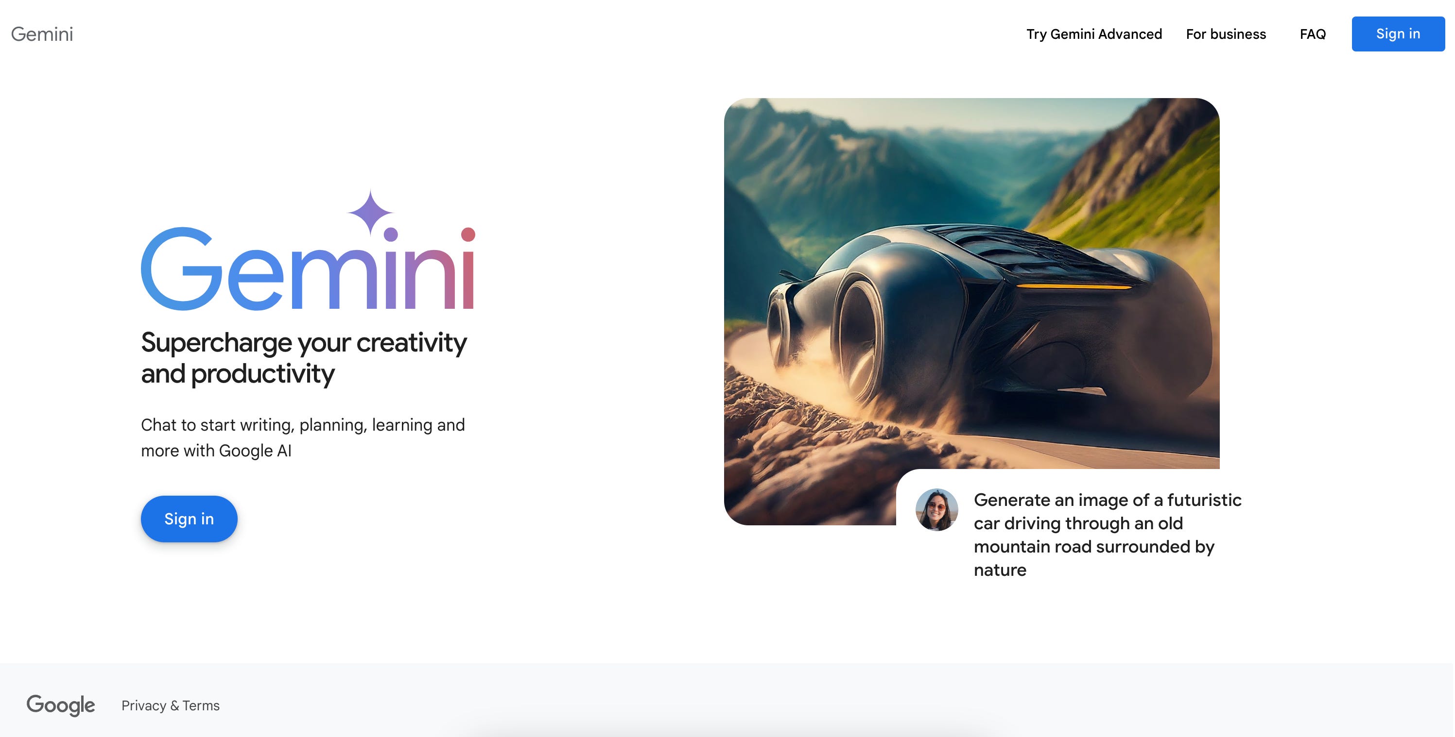
Google’s design language gives it a significant advantage — familiarity. It plays a crucial role in my interaction with the page. The process of signing in feels second nature, mirroring the action I undertake with Gmail. It’s integrated into the Google ecosystem, which significantly reduces barrier to entry.
There is an underlying sense of haste that shows up in the page's design and user experience (UX) decisions [3 subtext sections, different fonts, disconnected CTAs throughout). It's as though the layout and functionalities were crafted with speed in mind, possibly at the expense of a more deliberate and thoughtful engagement strategy.
First time user experience: 7/10
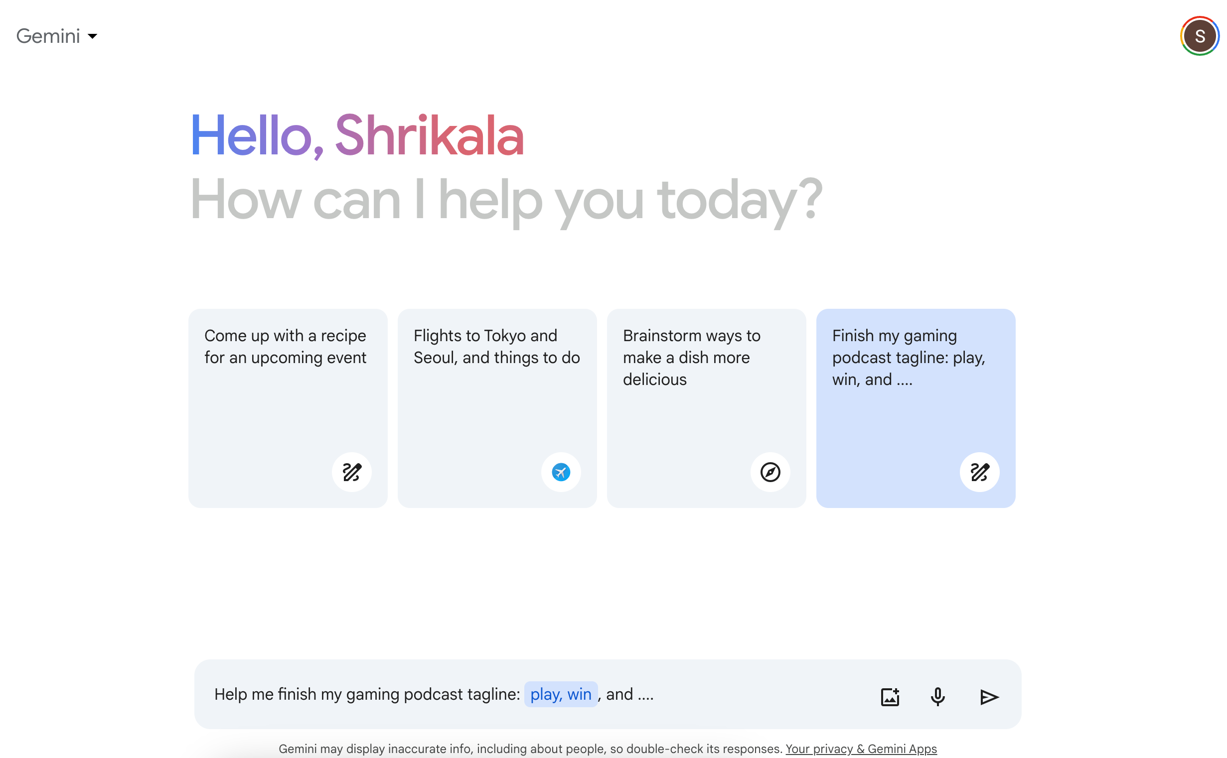
Gemini conveys a wealth of information in a manner that avoids feeling cluttered. The use of color and light fonts contributes to this balance, and it does not overwhelm the user. The thoughtful arrangement of icons alongside the chat bar offers a clear guide to its functionalities. Now that I’ve seen visuals in other interfaces, do I wish I could see it here? I sure do.
I’m excited to see how the positioning evolves across time and touchpoints — will there be a clear winner in the future? Or will all of them converge to say the same thing in different ways? Or does it even matter in a world where the model is the ultimate product?
Until next time,
Shrikala